How Viewing Distance Changes Sign Letter Size
Plan readable sign lettering using real viewing positions, message priority, contrast, spacing and a dimensioned proof before requesting a quote.
The farther away a sign must be read, the larger and simpler its main message usually needs to be. Record the nearest, normal and farthest useful viewing positions, then test the exact wording at the proposed finished size. Check visible letter height, contrast, spacing, lighting, mounting angle and reading time together. There is no single letter-size formula that works for every site.
In this guide
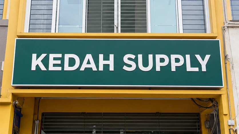
Most people choose sign lettering while zoomed in on a screen. The real test is different: can someone recognise the important words from the road, car park or walkway where they will actually see the sign?
A practical brief starts with those viewing positions, then works backwards to the message, contrast and finished letter height.
What matters most
- Record the nearest, normal and farthest useful viewing positions instead of measuring only the wall.
- Give the largest space to the one name, direction or instruction people must recognise first.
- Ask the proof to show actual visible letter height, not only a font point size.
- Review the exact wording from the real angle and lighting conditions before approving production.
Record the real viewing positions first
Do not begin with a font size in a design file. Stand where the intended reader will actually be. Record the nearest, typical and farthest useful positions; whether people will be standing, walking or travelling in a vehicle; whether the view is straight on or angled; the sign height; obstructions; and the relevant daytime, lower-light or after-dark conditions.
Take a wide photo from each important position. Mark the proposed sign area and note an approximate viewing distance on the image. These photos do not replace final measurements or a site assessment, but they explain the reading task more clearly than a close-up of an empty wall.
- Nearest, typical and farthest useful viewing positions.
- Standing, walking or vehicle-based reader.
- Straight-on or angled approach.
- Trees, awnings, parked vehicles, columns or other obstructions.
- Mounting height and relevant lighting conditions.
Give the largest space to the most important message
A sign becomes harder to read when every detail competes for the same space. Decide what the reader must recognise first. For a shopfront, that may be the business name. For wayfinding, it may be the destination and arrow. Contact details, a tagline or a long product list may belong on a separate panel viewed from closer range.
Making all text larger does not solve an overloaded sign. Reducing the message can create more useful letter height, clearer spacing and a stronger visual hierarchy without increasing the panel dimensions.
- Primary recognition: the shortest name, destination or instruction.
- Secondary context: one useful qualifier when space allows.
- Close-range details: phone, web address or unit number only where people have enough time and proximity to read them.
Treat distance bands as different reading jobs
Instead of guessing one size, divide the brief into practical distance bands. Close-range content should be easy to find without crowding. Across a room, forecourt or car park, the primary name or direction should be obvious before smaller details. Across a road or from a moving viewpoint, a shorter message with larger primary lettering is more useful than small contact details.
High-mounted or angled signs must be reviewed from the actual approach points, not only from directly below. If one sign must serve several bands, it may need a large recognition element plus a separate close-reading panel. These are site observations, not a compliance formula.
- For close range, inspect a representative full-size section.
- For a room, forecourt or car park, test the primary words separately in a wide site view.
- For a moving viewpoint, reduce the message rather than relying on small details.
- For a high or angled sign, review every actual approach point.
Letter height is not the same as font size
A point size shown by design software does not directly tell a buyer how tall the visible capital letters will be after production. Different typefaces use their internal font area differently. Ask the proof or drawing to show the finished sign width and height and the actual height of the key visible letters in millimetres or another stated unit.
Check whether thin strokes disappear at distance, condensed or decorative letters become hard to distinguish, spacing remains clear after fabrication, a logo has details that will not survive at the proposed size, and illumination creates glare or weak contrast.
The U.S. Access Board guidance links visual-character height with viewing distance and also addresses contrast, finish, character form, stroke and spacing. It is used here only as a comparative accessibility reference, not as a Malaysian approval rule. Relevant local, building or safety requirements still need to be checked for the actual sign.
Use contrast and empty space before adding effects
Readable lettering needs separation from its background. Review the proposed colours in the expected light, including the unlit appearance of an illuminated sign. A busy photograph, patterned background, reflection or low-contrast colour pair can reduce clarity even when the letters are physically large.
Keep clear space around the main name or instruction. Shadows, outlines and glow effects should solve a real contrast problem rather than create visual noise. Final lighting, materials, electrical scope and installation remain job-specific.
Use a practical proofing method before production
Use a dimensioned proof showing the finished panel size, key letter height, quantity, colours and construction description. Print one important word or representative section at 100% where practical. Place a clearly labelled positioning visual on a wide site photo, treating it as a guide unless it is explicitly a scaled construction drawing.
Review the primary words from the recorded near, typical and far positions under relevant lighting. Verify spelling, logo version, letter case, numbers, arrows, language and orientation before approval. A phone screen can check content and placement, but zooming makes it unreliable as a full-size proof.
- Dimensioned proof with actual key letter height.
- Representative full-size sample where practical.
- Labelled site-photo mock-up.
- Distance and lighting check.
- Final content and orientation check.
Readability details to include
Seri Jadi's physical shop is at 5, Jalan Taman Indah, Sungai Petani. Send the brief, dimensions, exact wording and site photos through the contact or WhatsApp route. Final artwork, construction, materials, lighting, installation, price, production timing and fulfilment are confirmed for the individual job.
- Sign purpose, indoor or outdoor location, installation address or postcode.
- Available sign width and height with units, plus mounting height if known.
- Nearest, typical and farthest useful viewing distances.
- Reader movement, viewing angle and relevant lighting conditions.
- Primary words, secondary details, exact wording and language.
- Logo or artwork status and wide site photos from each approach.
- Required date and any known building, landlord, authority or safety requirement.
Frequently asked questions
Is there one letter-size formula for every signboard?
No. Viewing distance is important, but readability also changes with wording, typeface, contrast, spacing, lighting, mounting height, angle, obstructions and the time available to read. Record the real viewing positions and test the exact message at the proposed finished size.
Should every line on a shop sign use the largest letters possible?
No. Give the most space to the name or message that must be recognised first. Secondary details can be smaller when they are meant for closer viewing, or moved to a separate panel if the main sign becomes crowded.
What should a sign proof show besides the artwork?
Ask for finished dimensions, key visible letter height, colours, quantity, construction description and placement. Check a full-size sample where practical and review a labelled mock-up from the real viewing positions.
Sources consulted
Sources support the general guidance; the final choice still depends on the actual job.
Send Seri Jadi the available sign area, nearest and farthest useful viewing positions, wide site photos, exact wording, logo file, lighting need and required date. Ask for the proof to state finished dimensions and the actual height of the key letters.