Shop Signboard Colour and Contrast: A Proof Check Before Production
Test a shop signboard colour combination in greyscale, on a site photo and under relevant lighting before approving production artwork.
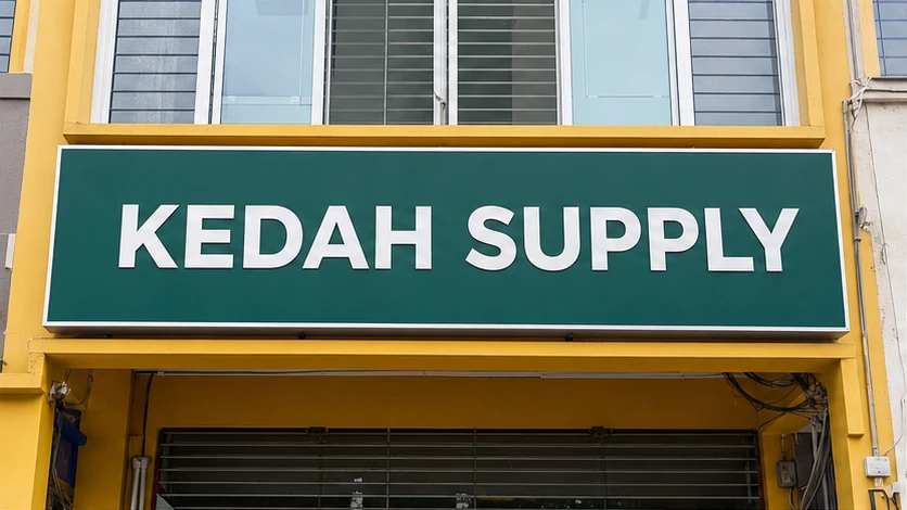
A colour pair can look polished when artwork fills a bright laptop screen, yet become difficult to read on a shaded shopfront or after a lightbox is switched on. Malaysian sun, rain-darkened surroundings, reflections and mixed night lighting can all change the viewing situation without changing the colour codes in the file.
Choose a signboard colour combination by testing the exact words, logo and background together—not by judging two swatches separately. Review a dimensioned proof at thumbnail size, in greyscale, on a wide site photo and under the relevant day, shade, unlit and illuminated conditions. If the main name loses separation, simplify the background or strengthen light–dark contrast before approving production.
What matters most
- Test the real name and logo, not isolated colour squares.
- Give the main wording a clear light–dark difference from its background.
- Check a wide shopfront view instead of relying on a close-up proof.
- Review illuminated signs both switched on and switched off.
- Record approved colour references, but treat the physical result as job-specific.
Start with the reading job, not a favourite colour
Write down what the sign must communicate first. For a shopfront, this is usually the business name. A descriptor, unit number or tagline may be useful, but it should not compete with the primary recognition task.
Next, record where people will see it: across a road, from a car park, along a covered walkway or directly outside the shop. Note whether the facade sits in full sun, deep shade, under warm street lighting or among visually busy neighbouring signs. This context tells the artwork team what the colour combination has to do.
Brand colours can remain part of the design without forcing every surface to carry the same colour. A difficult brand colour may work as an accent, border or logo detail while a clearer light or dark field supports the main wording.
How can you check contrast without specialist equipment?
Use a four-view proof check. It does not certify compliance or predict the finished material exactly, but it catches common artwork problems before production.
Do not treat a phone screenshot as a colour contract. Screens vary, brightness can be boosted and backlighting can make colours look more luminous than a physical surface. Use the views below to find risk, then confirm the actual production specification and proof route for the job.
- Normal colour: view the complete layout at the proposed proportions.
- Small preview: reduce it until the sign occupies only a small part of the screen. The main name should still separate from the background.
- Greyscale: remove colour temporarily. If wording and background collapse into a similar grey, the design may rely on hue while lacking useful light–dark separation.
- Wide site mock-up: place a clearly labelled visual on a full-facade photo taken from the normal approach. Check it without zooming in.
Why do bright colours still become hard to read?
Brightness and contrast are not the same decision. Two vivid colours can compete if their apparent lightness is similar. Thin outlines, gradients, photographs and glow effects may add more edges without making the wording easier to recognise.
Surface finish matters too. Reflections can interrupt the letters, while dirt, weathering and shadows can change the background around the sign. The U.S. Access Board’s visual-sign guidance uses light-on-dark or dark-on-light contrast and discusses non-glare finish. It is a useful accessibility reference here, not a Malaysian approval rule or a claim that one colour pair fits every shop sign.
A practical design response is often simpler: one calmer background, one clear main-word colour, adequate empty space and effects only where they solve a real separation problem.
Worked example: two brand colours with similar lightness
Suppose a business uses medium red and medium blue. On a white screen, blue letters over a red panel may appear colourful, but the greyscale preview shows both becoming a similar mid-grey. From the car park, the name blends into the panel.
Keep both brand colours, but change their jobs. Use a dark blue field, place the main name in white, and retain red as a smaller accent line or logo detail. Then compare the original and revised options on the same wide site photo, at the same size, with no zoom.
This example explains a decision method; it is not a customer project or a promise that these colours suit every material and light source.
What changes for an illuminated sign?
Ask to review both states. A lightbox or illuminated letter may have one appearance when switched off and another after dark. Light source, face material, colour layer, surrounding brightness and viewing angle can affect the result.
The artwork proof should identify which areas are intended to light, which remain opaque and which colour references are being used. A screen visual is still an illustration unless the quotation states a physical sampling or proof method. Final material, lighting, electrical, installation and approval requirements remain specific to the site and quotation.
Copy-and-send colour proof brief
Include the sign purpose and installation address or postcode, main words that must be recognised first, secondary wording, exact logo file and approved brand references, and the available sign width x height with units.
Record normal viewing positions, site conditions and whether the sign is non-illuminated, illuminated or not decided. Ask to see a full-colour proof, greyscale check, wide site mock-up and relevant unlit and lit views.
Ask the proof to label finished dimensions, main colours, materials or construction description and illuminated areas. Send the brief through Seri Jadi’s signboard and signage page or contact page. Artwork scope, materials, colour references, lighting, price, timing, installation and fulfilment are confirmed for the individual quotation.
- Viewing positions: road, car park, walkway or close range.
- Site conditions: full sun, shade, reflective glass, mixed lighting or other.
- Required date for confirmation.
Frequently asked questions
Is black and white always the best signboard colour combination?
No single pair is best for every sign. Strong light–dark separation can help recognition, but brand identity, surrounding facade, lighting, material, reflections and the exact wording still matter. Test the actual layout in its site context.
Can a screen proof show the exact finished sign colour?
Not by itself. Displays, brightness, colour profiles, materials, inks, films and illumination can differ. Use a screen proof to check content, hierarchy and contrast risk, then follow the physical reference or approval method stated for the job.
Should a signboard use every brand colour?
Not necessarily. The main name needs the clearest reading role. Additional brand colours can be used selectively for accents or secondary elements when they do not reduce recognition.
Sources consulted
Sources support the general guidance; the final choice still depends on the actual job.
Send Seri Jadi the sign purpose and location, main wording, logo and brand references, dimensions, viewing positions, site conditions, lighting state, artwork status and required date. Artwork scope, materials, colour references, lighting, price, timing, installation and fulfilment are confirmed for the individual quotation.
WhatsApp +60 10-451 8088